4:50 pm
March 19, 2020
Emily posted earlier today about the jump in initial claims for unemployment insurance. The first of these charts shows the four-week moving average of claims.
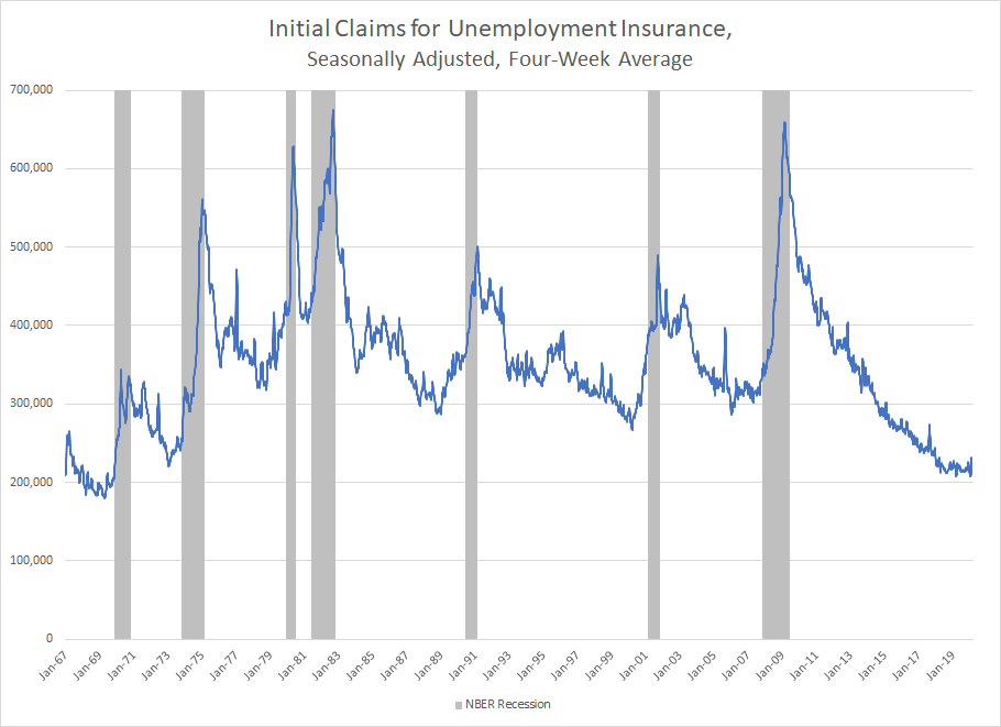
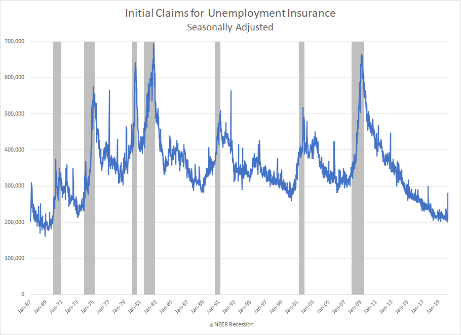
Claims are usually shown as a four-week average in order to dilute week to week volatility. In the present situation, averaging hides the story. Here is a chart without averaging.
Tags: COVID-19 , COVID-19 & the economy