
2:00 pm
June 4, 2020
Here are four charts presenting initial claims for unemployment insurance reported by Washington state’s Employment Security Department (ESD) by sector for the period from March 1 to May 30.
A note of caution about these numbers: In recent weeks, Washington’s unemployment insurance system has been hit by a rash of fraudulent claims (press releases here and here). As a result, the unemployment insurance claims data released weekly by ESD overstate the number of individuals who have truly lost their jobs.Most of the false claims appear to have occurred during the May 3 to May 9 and May 10 to May 16 weeks.
The first chart shows the number of claims by sector.
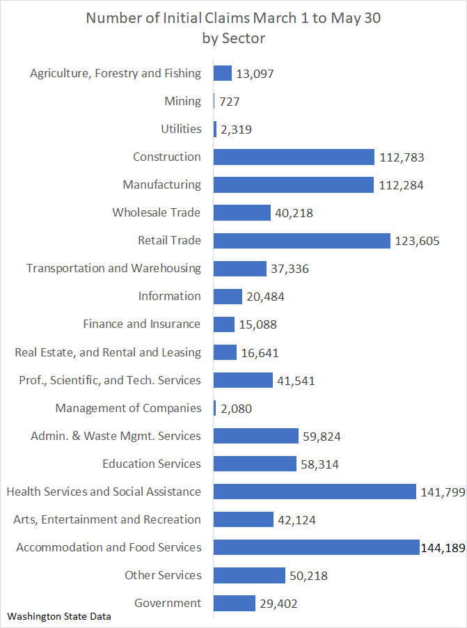
The five sectors with the greatest number of claims are, in descending order, accommodation and food services; health services and social assistance; retail trade; construction; and manufacturing. Together these five sectors accounted for sixty percent of the initial claims.
The second chart shows initial claims sector as a proportion of the sector’s employment in the month of February. I have separated claims into three time periods: March 1 to May 2, May 3 to May 16 (the period believed to have the most fraudulent claims), and May 17 to May 30 (the most recent two weeks).
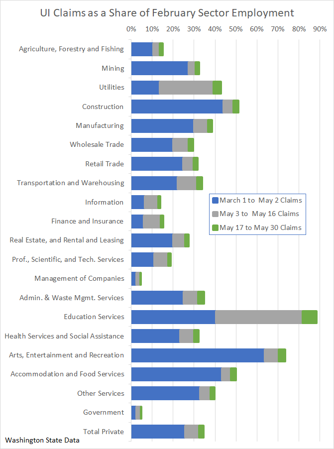
The total number of private sector claims from March 1 to May 30 is equal to 34.4 percent of February private sector employment. The education services sector has experienced the greatest total number of claims relative to February employment, 88.5%. However, because nearly one-half of those claims occurred between May 3 and May 16, the period with a high number of fraudulent claims, this 88.5% figure severely overstates the number of legitimate claims.
The third chart shows, by sector, the percentage of total March 1 to May 30 initial claims that were received during the problematic May 3 to May 16 interval.
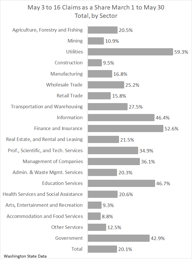
For all sectors together, 20.1 percent were in the May 3 to May 16 interval. The variation across sectors is huge, from 59.3 percent for the utility sector, to 8.8 percent in the accommodations and food services sector. Generally, sectors for which the share of total March 1 to May 30 claims received during the May 3 to May 16 interval is high are sectors with low numbers of total claims relative to February employment.
The fourth chart is a scatter plot with claims as a share of February employment measured along the vertical axis and the sectors’ average weekly wages in 2018 (the most recent year for which average wages are available) measured along the horizontal axis. Claims from the problematic May 3 to May 16 interval are excluded.
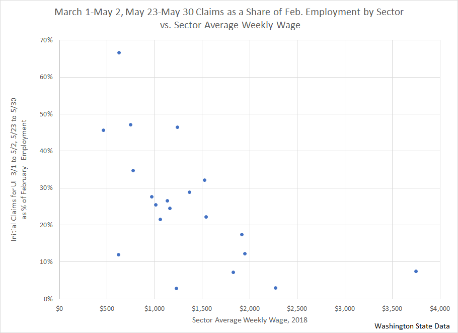
Low-wage sectors have had more initial claims relative to employment than high-wage sectors. The correlation coefficient between claims as a share of employment and average weekly wage is −.593.
Categories: Categories.Tags: COVID-19 , COVID-19 & the economy